
Logo Usage Guidelines
Please note that you should always type Click IT with a space between "Click" and "IT".
For example, do NOT type or write our name in these formats:
NO: ClickIT, Click-IT, or Clickit
![]() YES: Click IT
YES: Click IT
Brand Color
Blue: hexadecimal (#000B3D or #00234B) , rgb (0,11,61)
See all build-out colors for your Click IT store: Click Here.
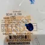
Clickit Blue - Flat for walls. Behr formula is available at Home Depot.
Our logo serves as an example of the tone, aesthetic, and values of our entire brand. Setting guidelines ensures that the logo is used properly and as we had intended. These guidelines are called "logo usage guidelines" and are an integral part of our brand strategy and brand style guide.
Our logo is a combination of text and visual imagery that serves two purposes. 1) It tells people the name of the company and 2) it creates a visual symbol that represents our business. Our logo has a powerful symbolic association connected to people's memory.
Franchise owners have been granted written permission to use our registered logo in their executed franchise agreement. In using our logo, please follow the guidelines outlined below.
DOs
- Only use the Logo with the ® (registration mark) in the lower righthand corner. This protects the brand you've invested in.
- Use a large enough margin around the logo to let it breathe.
- Make sure the logo has appropriate contrast with the background.
- If placing the logo over an image, make sure the area underneath it is not busy.
- If placing the logo over a busy image, darken or lighten the image using brand colors to ensure proper contrast.
DON'Ts
- Do not use the Logo without the ® (registration mark) in the lower righthand corner.
- Do not add any effects to the logo or symbol (such as drop shadow, glow, etc.), without written permission.
- Do not fill the logo, thereby negating the logo's transparency.
- Do not place the logo on top of a busy or high contrast image, unless a wide enough margin separates the elements visually.
General Guidelines
- Make sure the logo has appropriate contrast with the background.
- Only use the color blue, in standard or reversed, as illustrated in the logos above.
- Maintain the shape of the logo. The square and arrow should remain the same size relative to one another. Never change the block shape of the letters or their position to each other.
- If placing the logo over an image and the image is too busy, darken or lighten the image behind the logo.
- Make sure the logo has appropriate contrast with the background.
- If the background is too busy and neither dark nor light logos look good, it is acceptable to blur the background.
- It is best to avoid semi-transparent overlays for the sake of increasing the logo contrast. Best to use the version of the logo with the most contrast. If the background is too busy, it is recommended to use a colored overlay.
- Use as few different colors as possible, especially when using type alongside the logo. The best case is the type and logo are the same color.
- Do not apply effects to the logo. This includes drop shadows, glows, 3D effects, etc. The beauty of our logo is its simplicity, so do not detract using ornamentation.
-

Changing the color of the arrow is allowed.
You are allowed to change the color of the arrow as the sample shows, to emphasize or distinguish a division, category, or service. Changing any other internal color is prohibited. Only changing the color of the arrow is allowed.
- Do not use a logo image with a background on top of another background. This is unnecessary and creates noise, detracting from the logo's elegance.
- Do not apply drop shadows to the logo. If there is not enough contrast consider modifying the background instead or use a version of the logo that offers more visibility.
- If placing the logo over a photograph or illustration, it is best to use the least busy portion of the image. Consider modifying the image to create a less busy area to better suit the logo. In general, it is best to modify the background to achieve contrast rather than the logo. Respect the logo!
- You can not rearrange any of the components of the logo. You can enlarge the arrow only or add animation with special permission.

Note: Any deviation from these guidelines must receive written permission. Please email your artwork to [email protected] for approval. We reserve the rights to all artwork shown, including the right to approve or disapprove the use of our logos and artwork provided on this page. Please don't hesitate to contact us with any questions or concerns.